ThePositiveXP
audience: Potential viewers browsing the Discovery page in Twitch.tv and those who may want to consult a health professional
completion date: Fall 2022
objectives: Create a branding/streaming graphics package for use on Twitch.tv that includes: logo, profile picture/banner, offline graphic, panels, "stream starting" and "stream ending" full-screen graphics, and an in-game overlay. Later on requested a business card.
approach: The first thing I asked the client ("Positive") was what kind of attitude he wanted to convey about his content and the community, to which he said he wanted it to be very casual, fun, and welcoming. He also mentioned that he eventually wanted to branch out into other avenues than just live-streaming, so to keep it pretty open to modification/variation. He specifically referenced having a smiley face since he wants to create a community called "A Positive Environment" and wanted it to be something that is universally recognized as a sign of happiness. To add his own spunk to it, we went with a graffiti theme throughout his graphics and stuck to a "cookie monster blue" and a bright teal for accent.
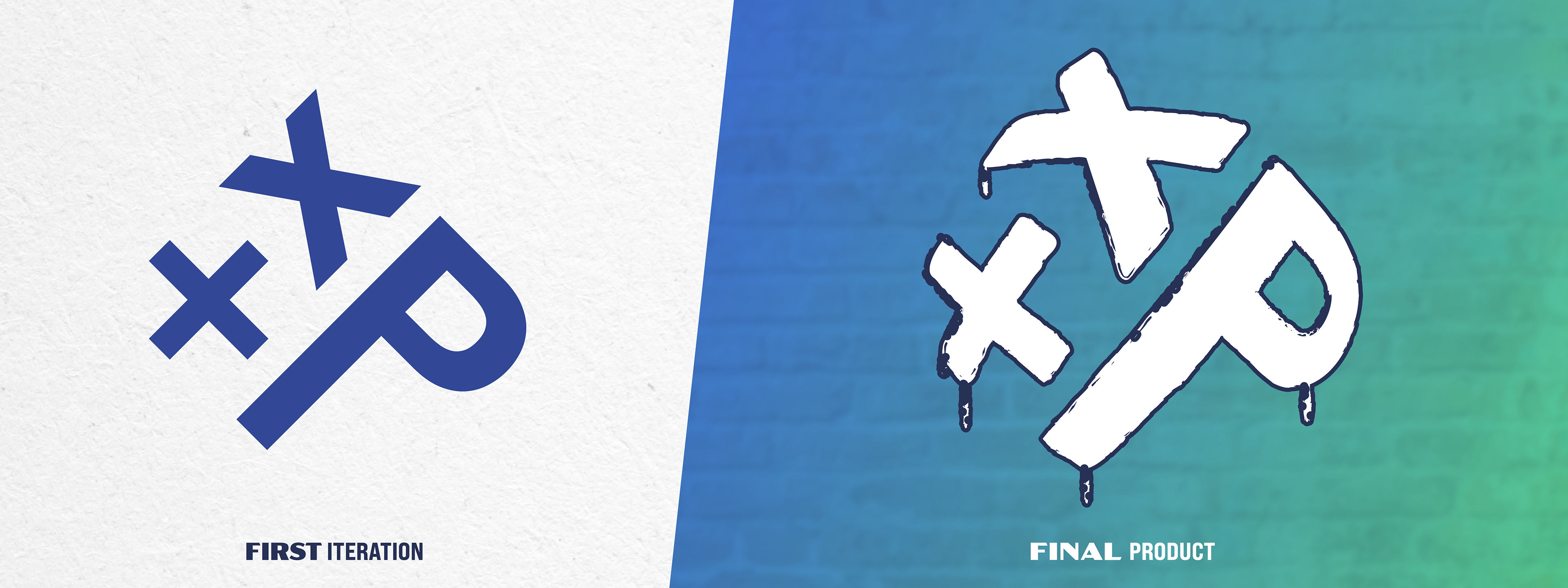
I began first with sketching out a more interesting tilted layout for a smiley face's primary components: the eyes and the smile. Then I realized I could swap out these features for "+xp" to shorten his display name. I then made it chunkier and rougher around the edges so that it looked more like a candid graffiti tag of a ":P" emoticon, then put it on a brick texture in his new signature colors. At first it was quite flat until I took some inspiration from a favorite video game series of mine called "Borderlands". In this game series, the iconic visual style uses cell-shading and a thick black outline on everything to give it that hand-drawn cartoon effect. So I added the outline and bulged the "+xp" logo to make it more interesting and resemblant of graffiti.
Now that I had the foundation set for the project, I moved on to create the on-screen overlays. For the on-screen overlays, he just wanted a camera box, a slideshow to plug external forms of engagement, and a place to give credit to his latest follower and latest subscriber. I went with a 16:9 area for his camera then gave him a slim, teal-accent frame with this logo up top. To break from the typical rectangle, I cut two opposing corners and put the "+x" and "p" from his smiley face in those corners. For the credits, I put them right below his camera and gave him the type specs as well as written instructions on how to set it up in this third-party software. For his slideshow, I made a handful of same-size panels reminding viewers to follow, subscribe with prime, check out his social media, and to join his Discord server.
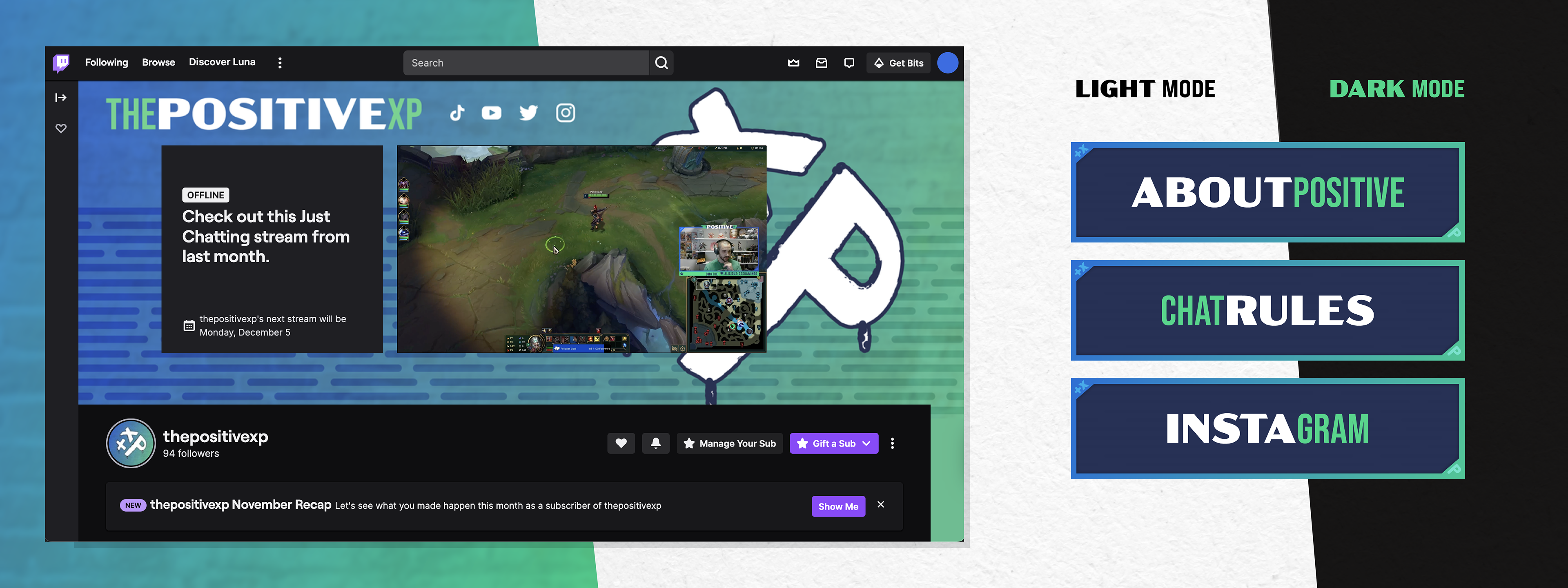
For the profile customization graphics, I went with the same logo and formatted it around the UI layout of the Twitch profile page by leaving plenty of room around the middle and ensuring the logo would be at least partially visible. For any assets that had a lot of text, I decided to add to the uniqueness of his aesthetic by using two different typefaces: Bebas Neue to contrast alongside the Acme Extrawide. I wanted to really draw people in and make them curious. I then gave him the hex code of the teal so he could blend his profile banner colors nicely with the graphics. For the offline graphic, I wanted to keep with the graffiti theme by having the logo sprayed over the word OFFLINE to break the mold that most graphics seem to fall into.
The "stream starting", "stream ending" and "be right back" full-screen graphics were a bit trickier because I had to now fit in a new vertical chat box with all the extreme horizontal elements I'd established previously. To help with this, I decided to add in some rounded lines on the side for a bit of asymmetry and to help the chat box not feel so out of place. I added this to the offline graphic as well so that it tied in better overall. I had to separate the "stream starting" graphic so that I could bring the timer into After Effects. I gave Positive the separated out "stream starting" elements and gave him guidance on how to assemble it nicely in StreamElements and OBS. In the future, I realize I don't have to send it over separated.
Finally, there were the panels that sit below the stream watching area. These are typically used to provide information to viewers in sections; usually there's an "About Me", "Donations", "Chat Rules", and so on. I wanted to continue on with the fun typography and the rounded lines texture, so I tried to use both Bebas Neue and Acme Extrawide in as many panels as I could, even for those that were one word. To borrow from the camera overlay, I chose to cut two of the opposing corners and provide a little "hidden" "+xp" all over the panels. Because these are actually quite small (~340px tall), I chose to not put brick as the primary background for these. This also helps to tie them in to the other graphics with the rounded lines repeating behind the headers.
Positive also requested a business card so he can start providing a Positive Experience into more places. At the time of creation, he was actively working to be a licensed health professional and does some photography on the side. For the business card, I kept the same logo but removed the outline since it was going to be the only element on that side of the card. I felt the outline was unnecessary in this case, and could be seen as bit goofy or un-serious if handed to someone looking for guidance on their health. I did, however, keep the brick texture on both sides. For the back, I kept the same fun typography for his name. I kept it a bit more tame for the actual information, only using Bebas Neue and ensuring the hierarchy is clear.
software: Adobe Illustrator, After Effects, Open Broadcasting Software (OBS), StreamElements
