Fit to be Tied

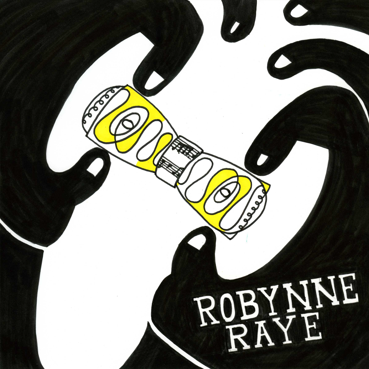
Created as part of the independent portion of and presented at my GAND 100 Assessments. The independent project was to create three ties based on three designers, and for one I chose to do Shigeo Fukuda. His use of ambiguous figure/ground interested me, and I wanted to apply that to a tie. Fukuda also had a design in which he played with an O that dominated the poster, having an arm made from the counter-space grab at the figure of the O. With this tie, I wanted to emulate the playfulness of that poster, as well as one of his other posters that shows arms tangled up in a cluster. Inspired by the tangled arms, I chose to use the Trinity knot. The second designer I chose was Robynne Raye. Her use of color and line caught my eye immediately, and I was particularly interested by a piece she did for a 2015 music festival. On her poster, she showed Mozart created with just one line and used the color yellow. I chose to apply my design to a rounded butterfly bow tie because I felt that it would work well with the flowing line across the tie.
Poetry Cube
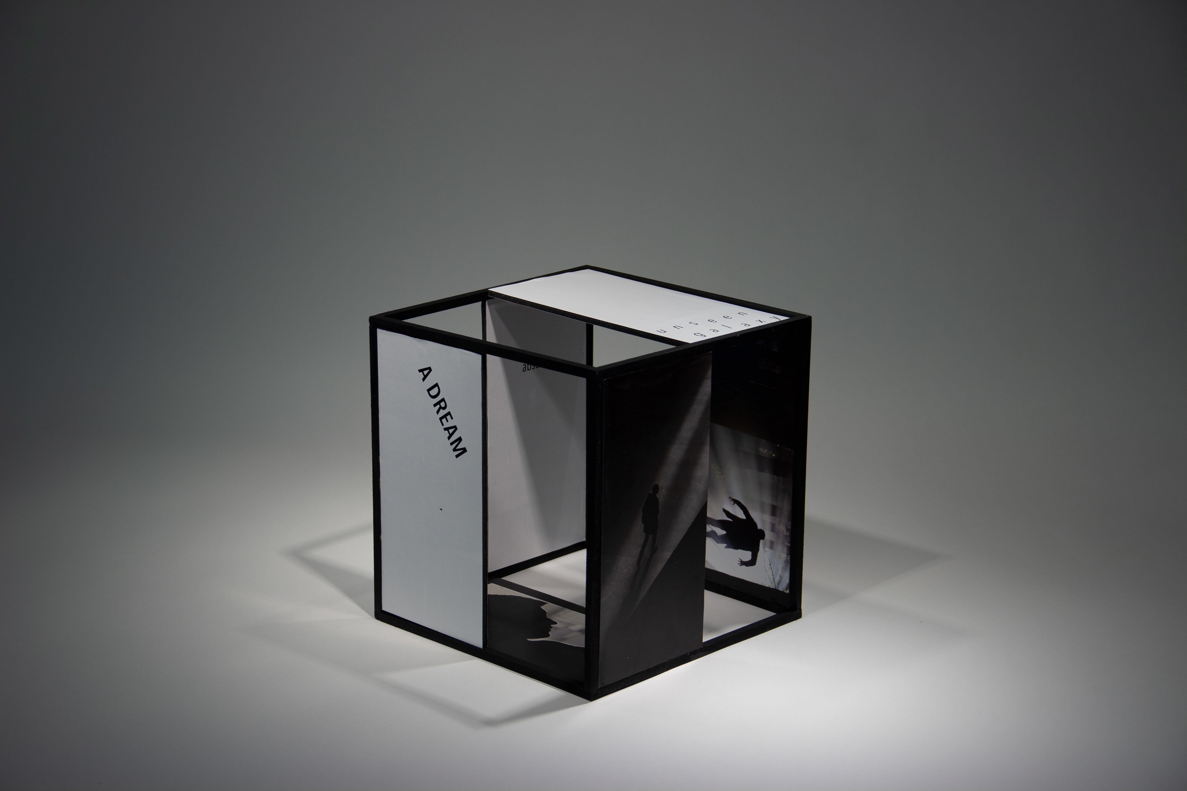


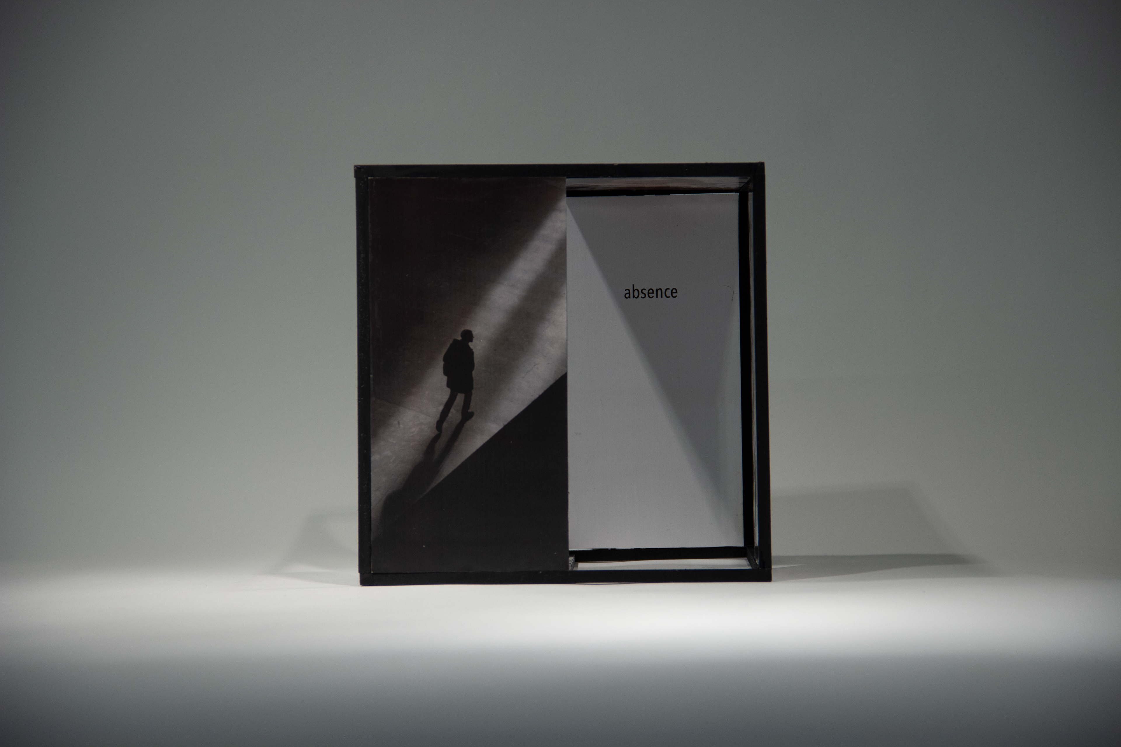
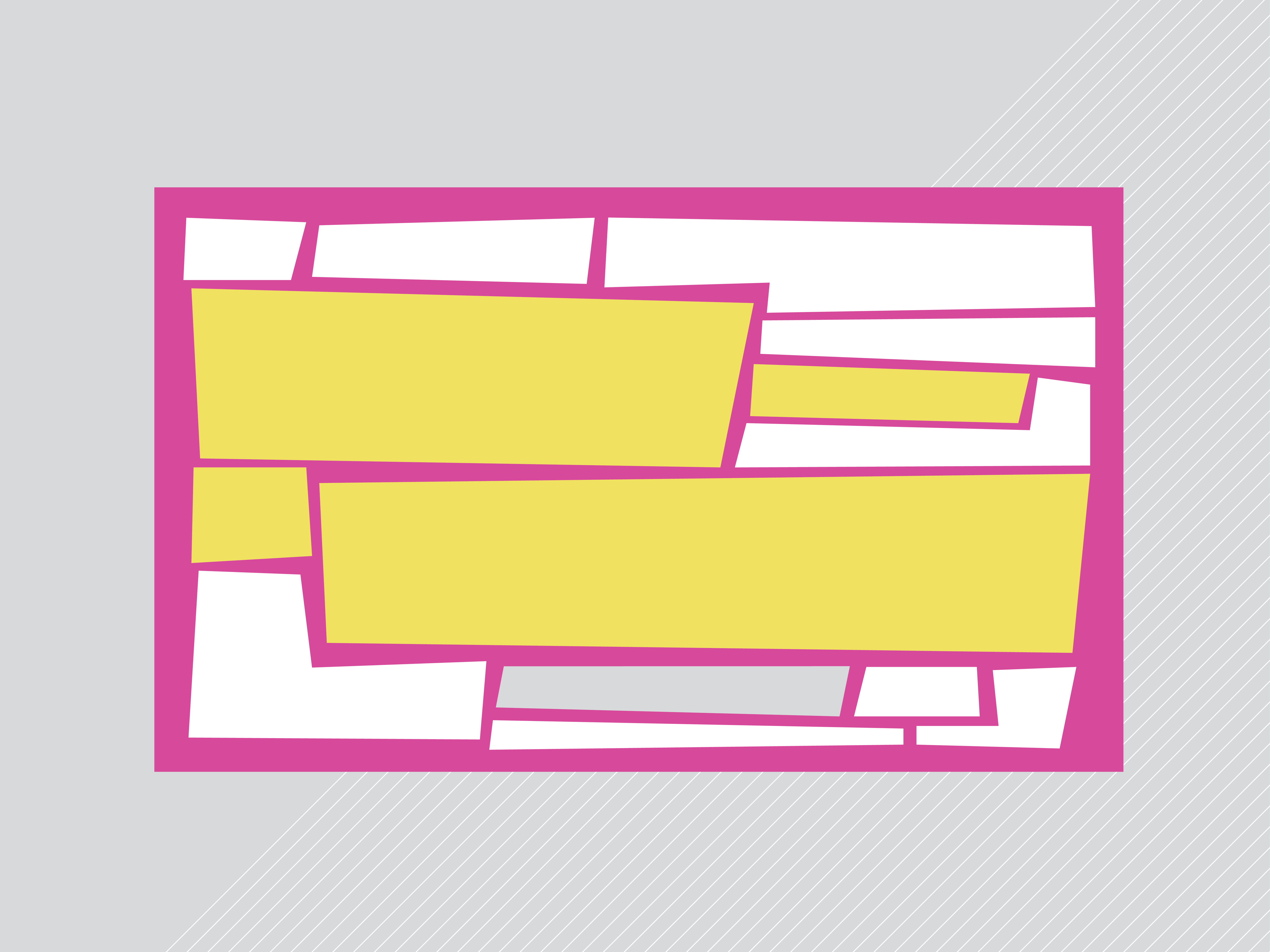
Presented at my GAND 200 Assessments in the Spring of 2019. The aims of this project were to use a 3 dimensional medium to convey the mood or attitude of the type when juxtaposed with an image, based on "Before Midsummer Above the River" by W. S. Merwin. I still wanted to convey a bitterness, so stuck with a condensed typeface and black and white images except for the picture of the photos. The picture of the old photos are the only ones in color because those were better times for my persona. Yet, I chose to pick a heavy, bold style for "ghosts" because those memories haunt him.
Poetry Book
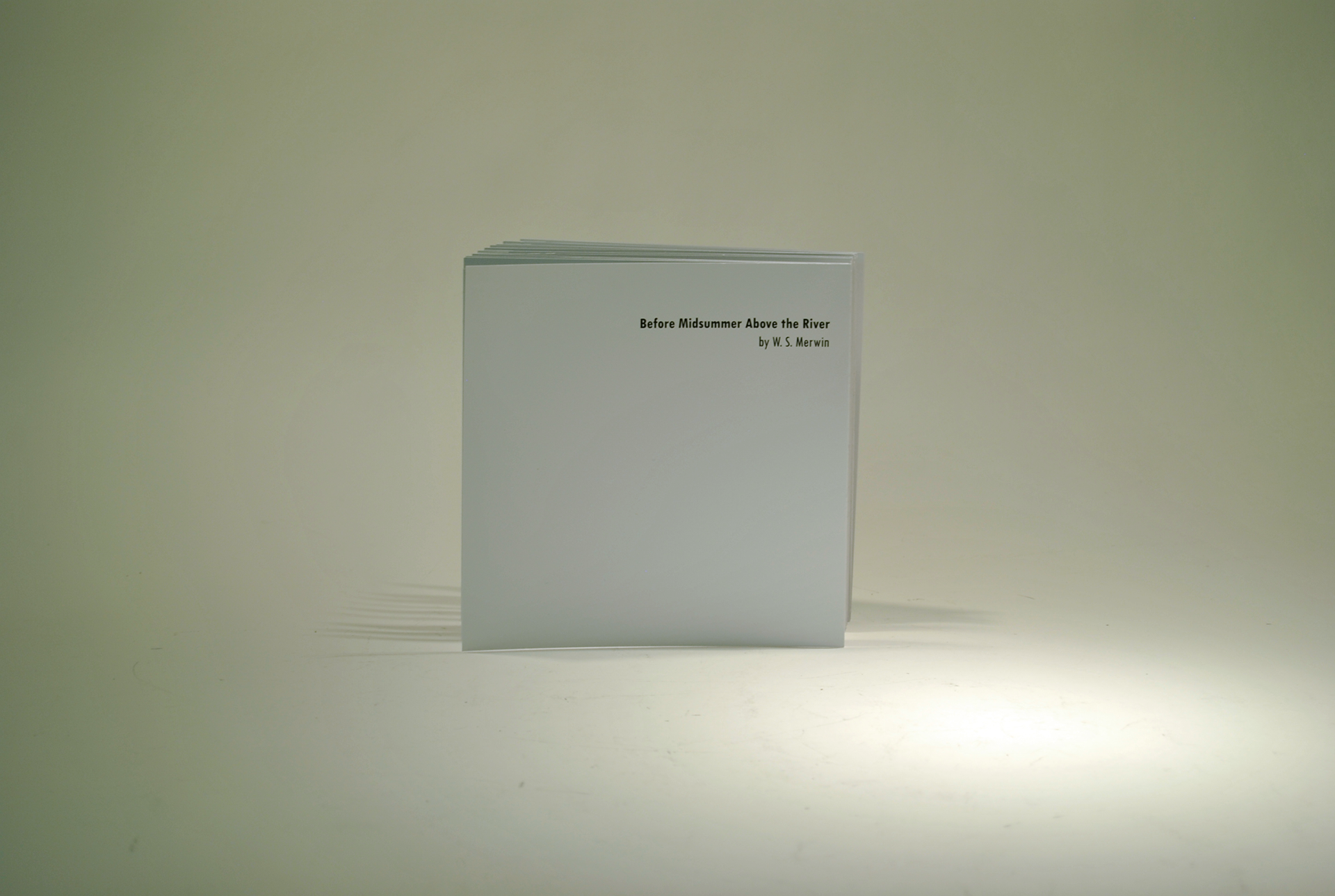
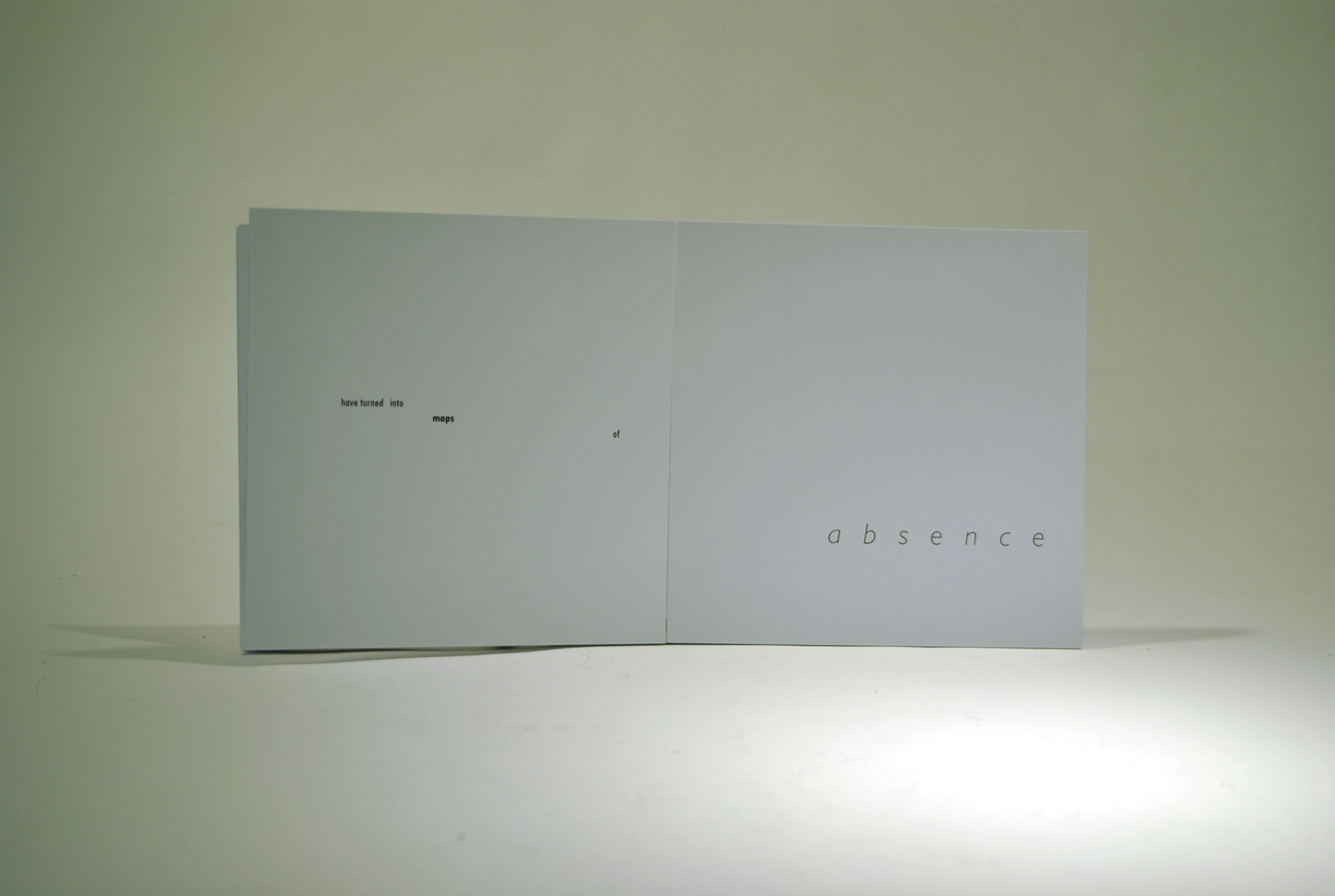
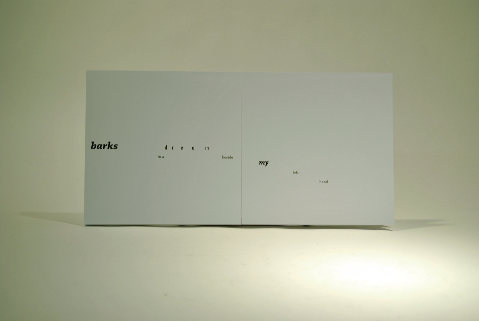
Presented at my GAND 200 Assessments in the Spring of 2019. The aims of this project were to use typography to express emotion from our chosen persona based on the poem "Before Midsummer Above the River" by W. S. Merwin. Using a more condensed, more angular typeface throughout the poem, I wanted to emulate the speaker/author as being someone who is angry about what has happened in the past, but at one point it switches to a serif typeface to show him
reflecting on happier memories.
reflecting on happier memories.
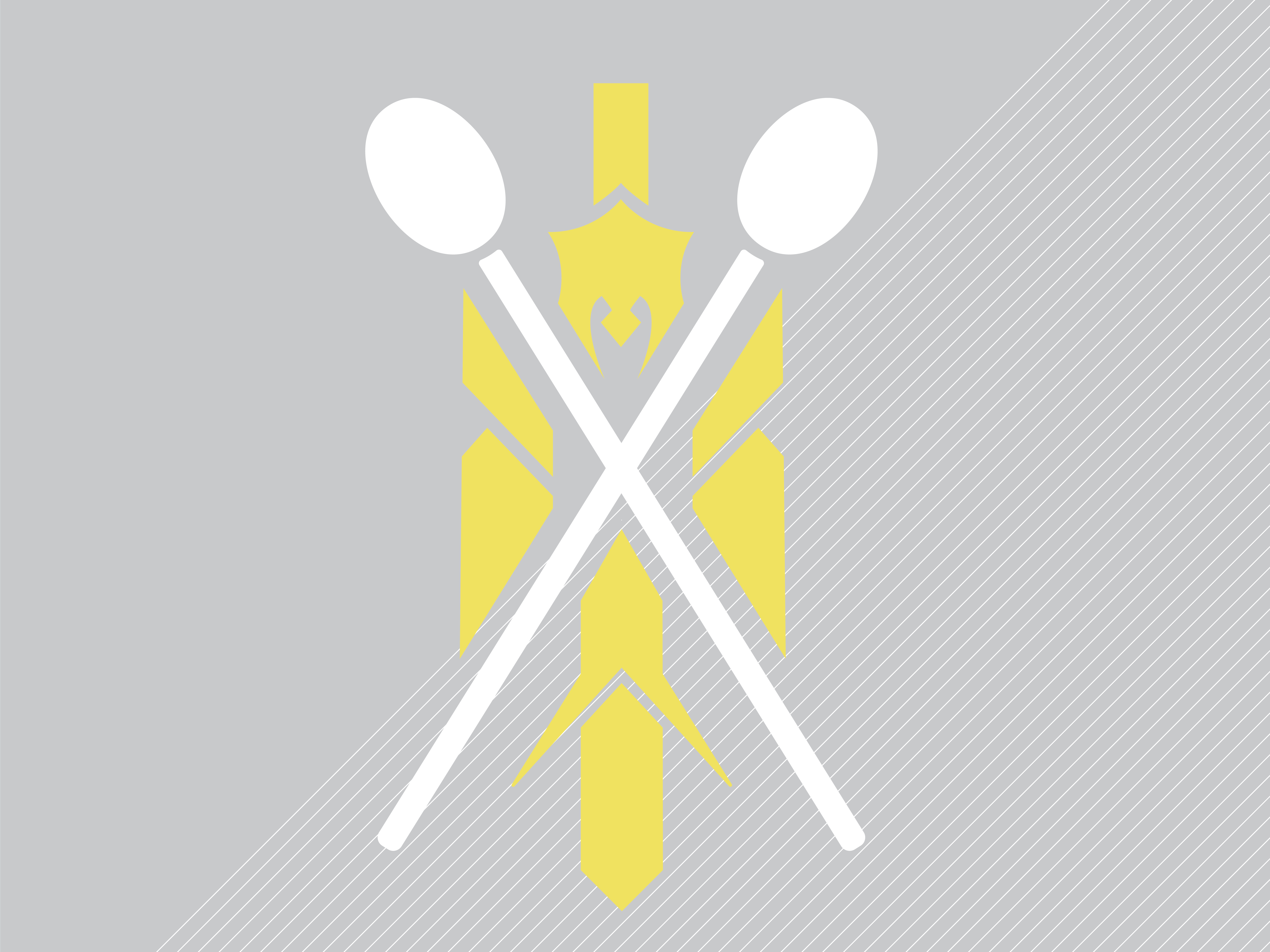
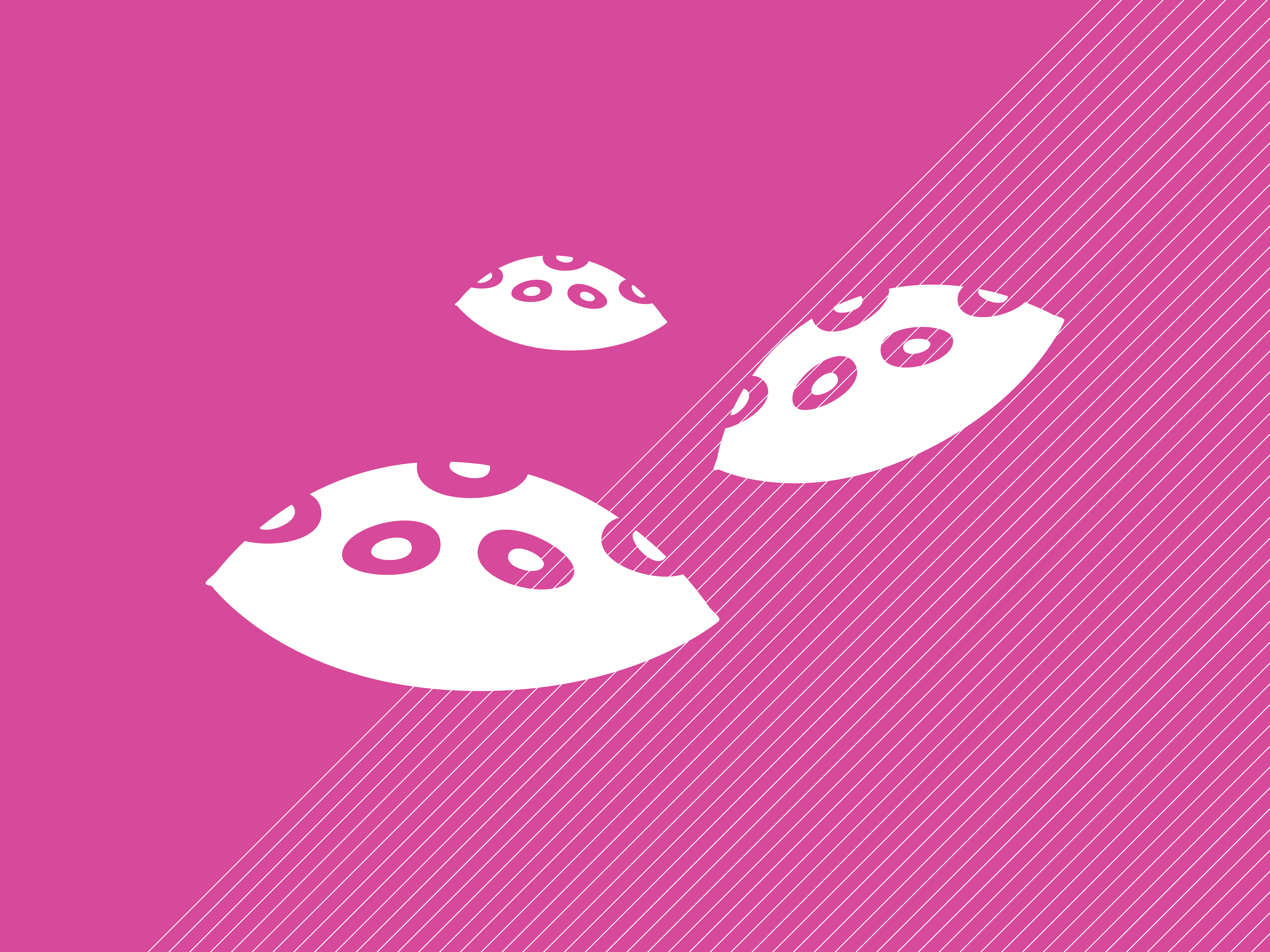
Topical Magazine


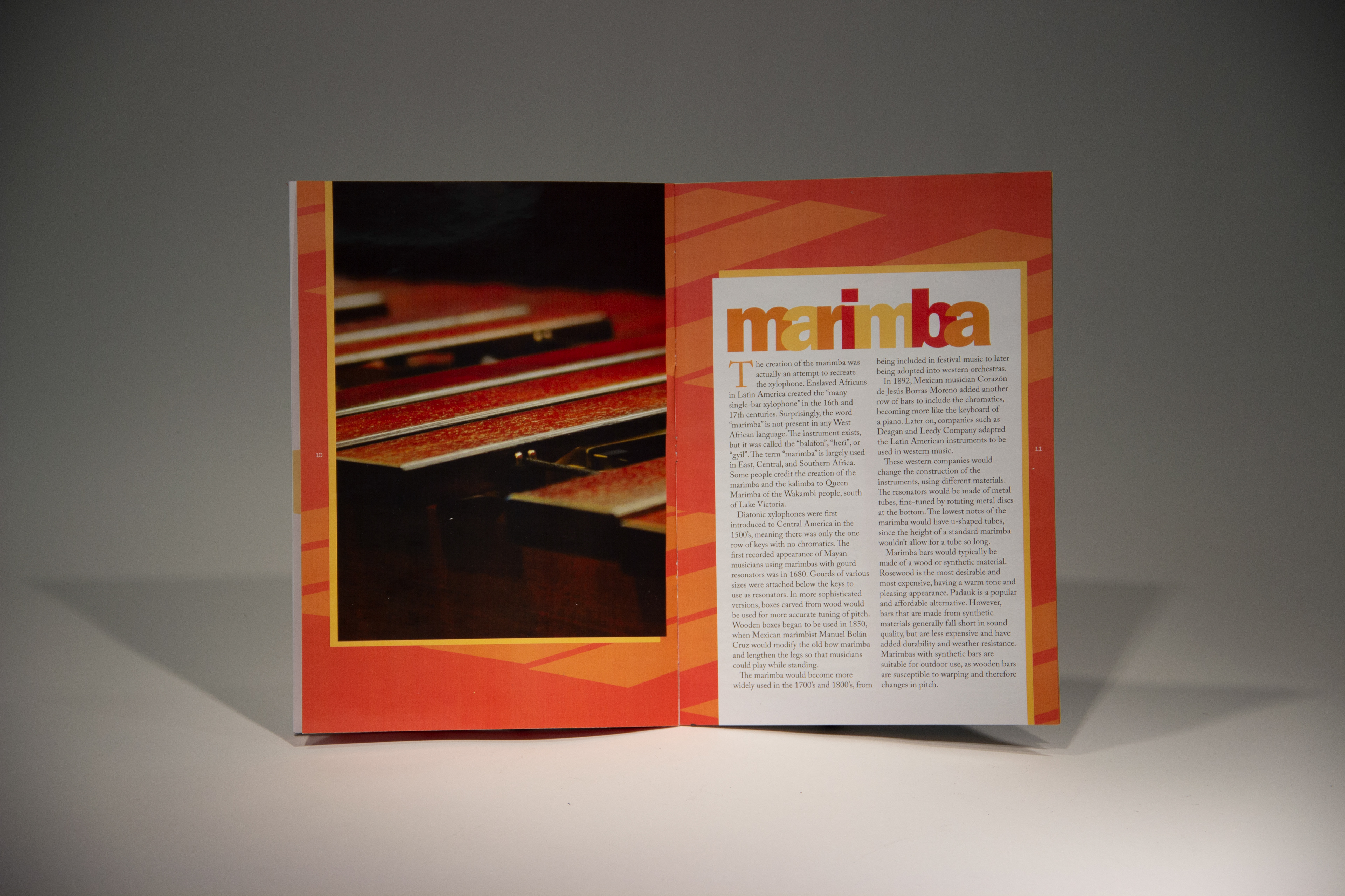


Presented at my GAND 200 Assessments in the Spring of 2019. To begin this project, my group unpacked a line from a Shakespeare play and came up with an umbrella topic, "Media". From there, each group member chose a subtopic, mine being percussion instruments. One of my hobbies is to play percussion, so I wanted to create a magazine that would explain the brief history of each instrument and educate the general public more about these instruments. I was inspired stylistically by Max Huber in the way he overlaps his elements and plays with opacity. This is best represented in my timpani spread. I believe that Huber has a very playful style, and I wanted to express the fun and excitement I get with percussion through my design.
Type Spec Book
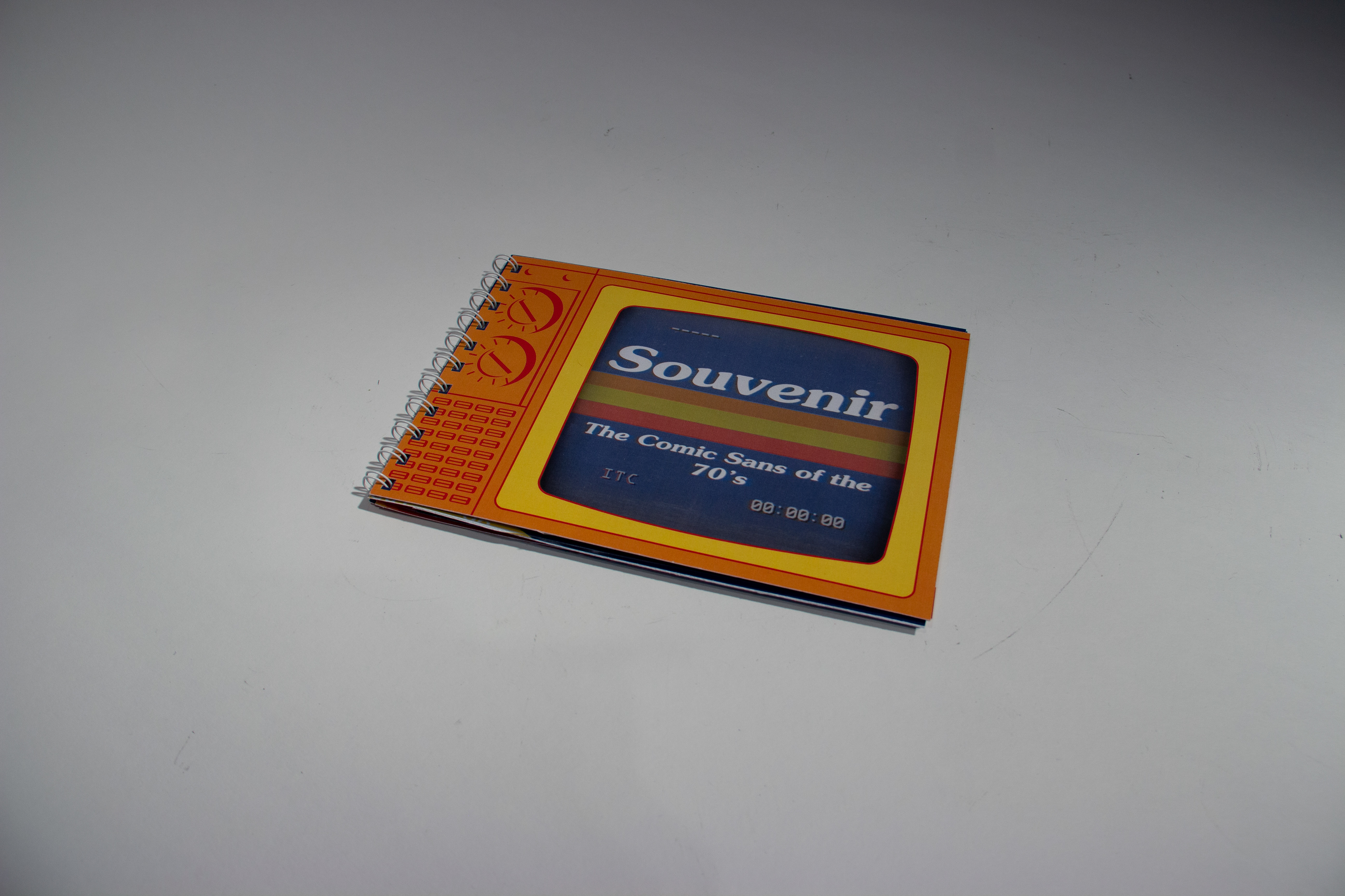
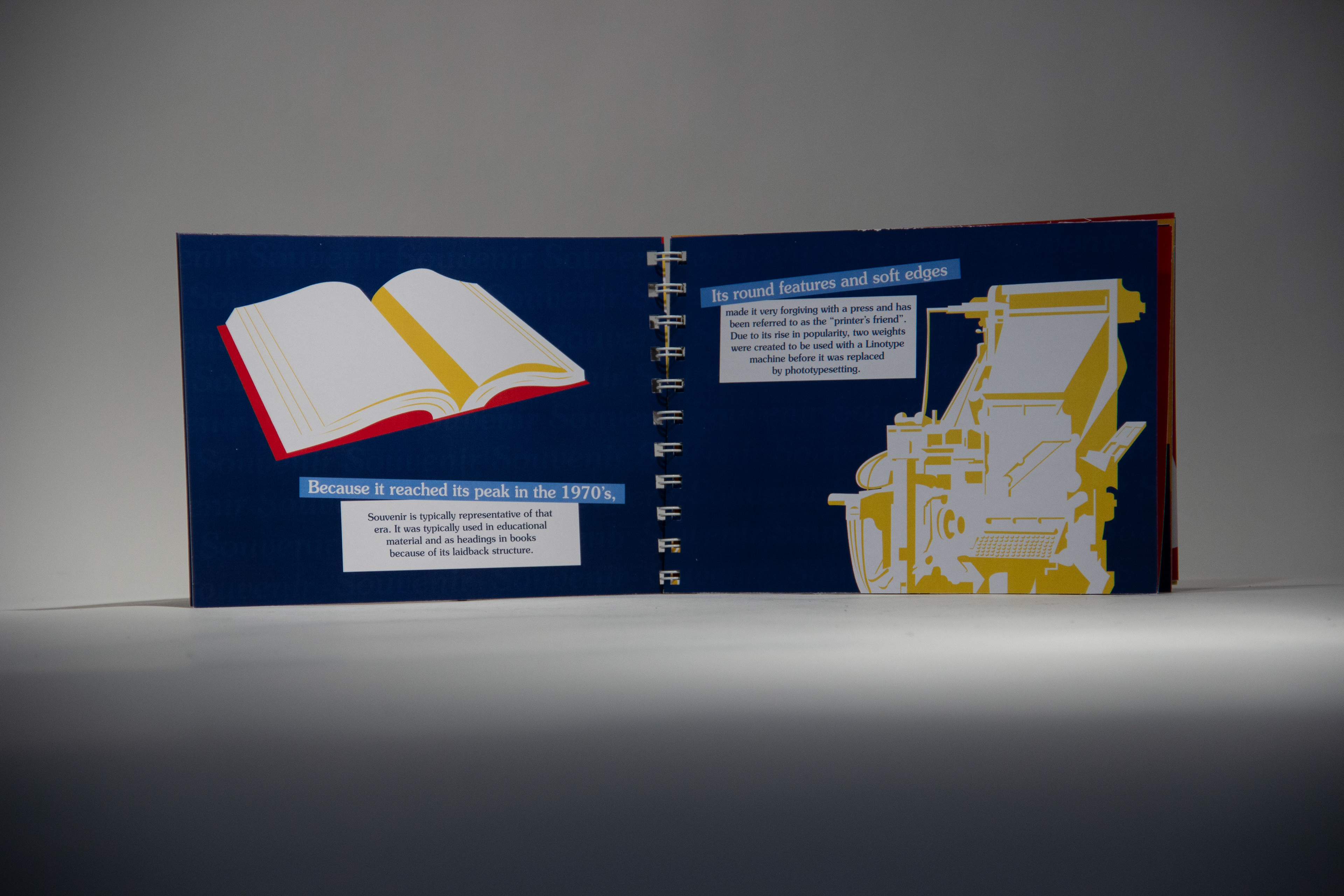


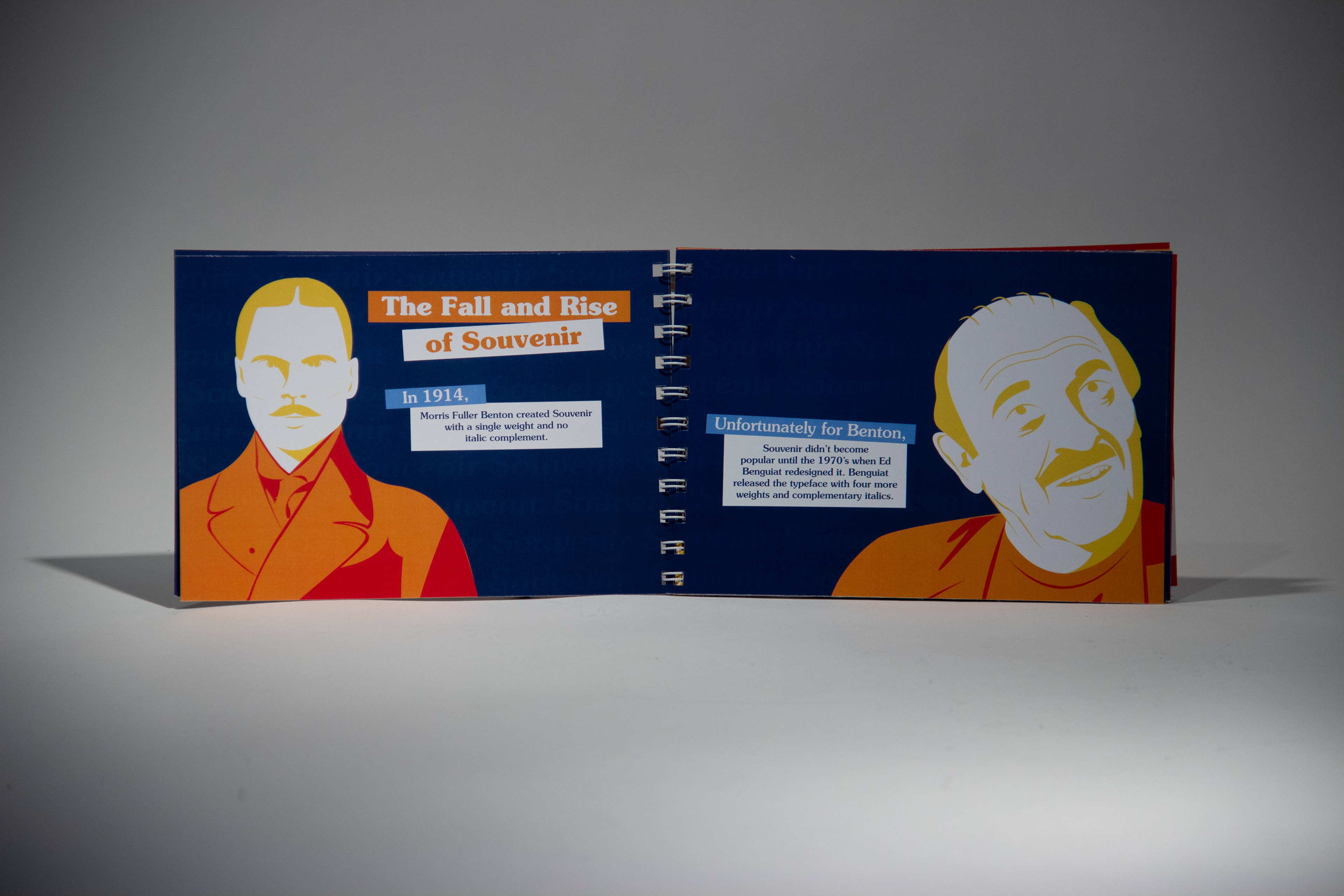

Presented at my GAND 200 Assessments in the Spring of 2019. This project was the Typographic Spec Book. Our team chose the typeface Souvenir to research and to showcase, only using Souvenir throughout the book and giving the history of the typeface. We used a double-gate fold to display the full alphabet, numbers, and symbols of Souvenir as well as some of its notable characteristics. All the spreads here were the spreads I created, plus 3 more that my teammates created (not
pictured on my site).
pictured on my site).
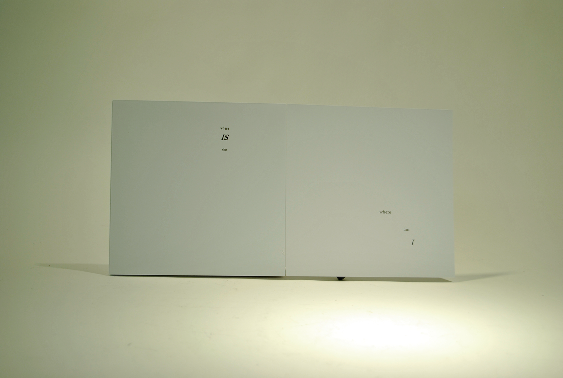
Poetry in Motion
Presented at my GAND 200 Assessments. The aims of this project was to add motion and images to our poetry book in order to convey the same emotions we had with just typography. I wanted to tell the story of a man in a bar who lets spill his true feelings about how he feels that "life just ain't fair" but reflects on his memories when it changes to a serif typeface. At the end, he looks to himself and asks "where am I" but still finds himself at the bottom of a glass of beer.