Get Out The Vote
audience: Registered and unregistered voters that weren't initially planning to vote in the 2022 Midterms
completion date: July through August 2022
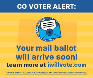
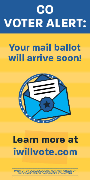
objectives: Create 15-second, 30-second, and static advertisements to encourage eligible voters to make a plan to vote on Nov. 8, 2022
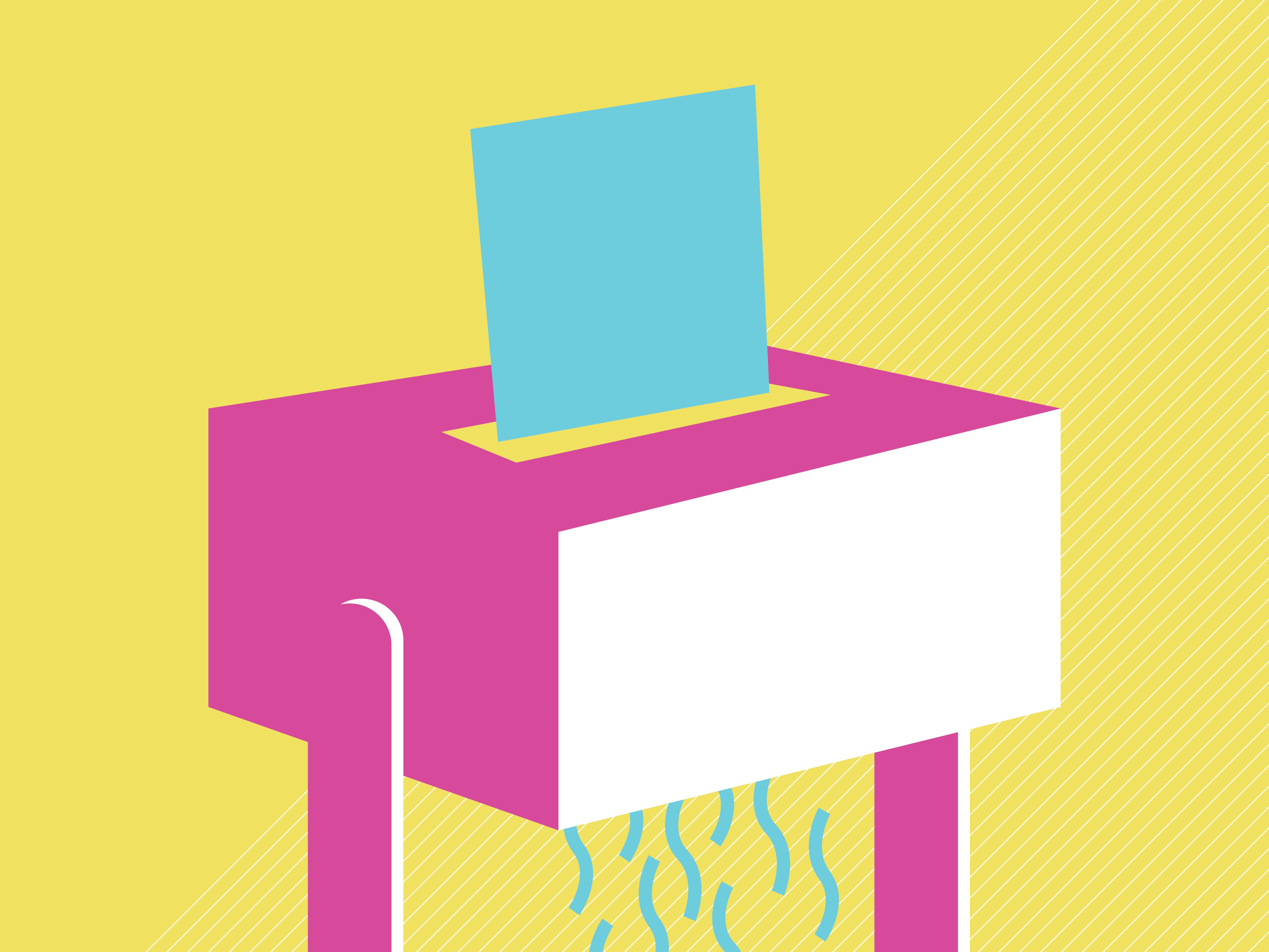
approach: Our team was tasked with conceptualizing and developing advertisements for the multi-million dollar nationwide campaign to get voters to take action for the 2022 Midterms election cycle. First we were given a couple states' rough scripts to begin building the video ad templates we would use for the rest of the project. Once we developed the video advertisements, we could build the statics from their stills. We met as a team to storyboard the animation-heavy piece with a mix of 2D characterized people and 3D objects ("Chase"), an animation with just 3D objects related to voting ("Preview"), as well as an animation that was mostly typography with flat, amorphous characters and simpler illustrations ("EV"). There was one more advertisement that was not as reliant on animation, utilizing what b-roll we could get approved ("EDay").
We had decided that we didn't want our advertisements to come off as a typical political ad with a doom and gloom attitude and boring, corporate looking text and visuals. We also knew that we would have a hard time getting b-roll approved so we wanted to save all our good b-roll for just one of our pieces. I worked on these four advertisements, although there were three other secondary templates we developed that were combinations of those four. For all pieces, our team was asked to create different variations of characters as applicable and to swap out language in the scripts depending on who the target demographic was and what state the advertisements were showing in.
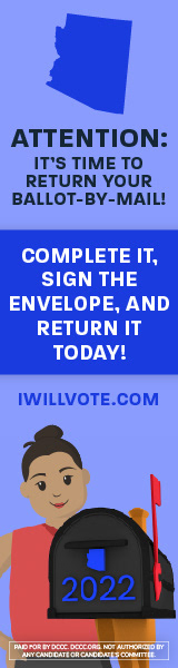
In the character animated piece ("Chase"), we had to design the characters to not be too realistic but not so cartoony that they become hard to relate to. We had a couple already made for a previous project, so we started with those and built a few more of diverse ethnicities, separating them all at each joint so that we could rig them and pass them on to our motion designer Jacob Samuels and creative director Kobina Yankah. We decided to place these characters in a 3D version of their state, with a mailbox popping up to let viewers know that it's time to return their mail-in ballot.
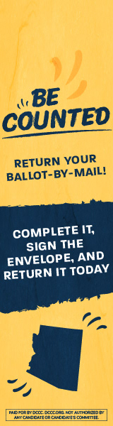
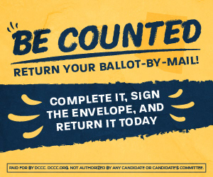
Next was the animation with both heavy type and 3D imagery ("Preview"), which I laid out all the text for. We had established we wanted a rotating panel in the center with our imagery for each section, so I wanted to pick a typeface that was a little laidback and fun, yet easy to read to reflect the interesting animation. I kept it simple but made sure to keep the text big to really draw viewers in. To complement the periwinkle/light indigo color of our other animations, I went with a pale yellow and some faint stripes in the background.
For the typography animated piece with amorphous characters ("EV"), we had the challenge of figuring out how to smoothly transition from each abstract idea to the next. I designed this one from scratch, keeping with a periwinkle-based palette because it did feel like a welcoming place to start and is quite different than the ever-so-serious political ads that were running for this cycle. I chose a gentle pale yellow and rounded, broken outlines for the imagery to add to the spunk of the piece. The section mentioning the ways to vote is interchangeable based on the script we were given for each state. There is a version with the number 2, displaying the envelope with a ballot as well as showing someone voting in-person, then we have a version where it's just someone voting in-person, and another version where it's someone dropping off their ballot at a dropbox. After this modular section, we came up with the idea of using the calendar as a transition tool into informing viewers that whether or not they voted would be public information. We would also use the boxes of the calendar to transition into the final portion, encouraging voters to make a plan on how, when, and where they will vote.
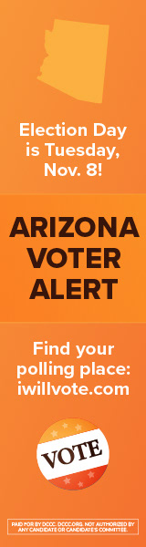
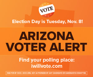
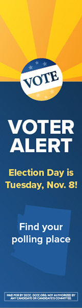
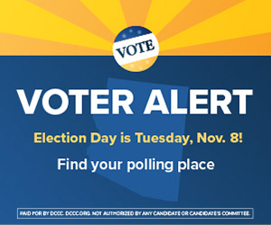
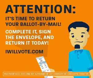
For the fourth piece I contributed to ("EDay"), this one was mostly b-roll. However, I wanted to ensure the few assets I created would stand out from the rest of them since each animated piece didn't have to look cohesive between each other, as long as this one template was consistent as we swapped out per-state language and imagery. Because orange isn't usually used for politics -- at least not as a primary color -- I chose to use it with some browns and a bright white in a more modern aesthetic. If there were voters that weren't going to be drawn in by our other three videos, then I wanted to make something that could appeal to those who prefer a more "sleek" and "clean" advertisement. I also thought that using a non-bipartisan color could help encourage voters to get out to the polls if they didn't feel like they were being pressured to vote one way or the other just by the style of the piece. Since we were using b-roll for a lot of this ad, I started by creating an easy-to-modify intro graphic. The text that repeats could easily swap out the new state name, the state shape in the background, and when there was an additional call to action I could simply put a graphic over the center where the text meets.
Next I moved on to the calendar, which I wanted to keep extremely simple. I only wanted viewers to be drawn to November 8, whether they read the text below or not. Even if they just took a glance and didn't watch the rest of the advertisement, I wanted them to remember that November 8 was the date marked. That would hopefully spur them to ask, "well what's so special about that date that I'm seeing a commercial for it?" I then created the web search graphic, informing voters that whether or not they voted is public information. I also wanted to keep this very clean and simple, making sure the contents of the search were what popped out. Maybe this would help active voters to check on their friends and families' records, or it would encourage inactive voters to make plans this year around. Then I made the final graphic, making sure I wouldn't have any hassle swapping out the state icon and the date for each state we were given. Once I passed those along and we formed a rough cut, we were able to see how I could incorporate the rest of the script as overlaid text. Keeping with the style of the search bar, I chose more rounded, outlined shapes to hold the white text to ensure legibility.
Once we nailed the video templates, it was time to create the static assets. We kept with the same aesthetics and our legal department was working on shortening the copy down further and further for us since some of these statics were just 50px tall. Not only did we have to swap out language per-state and swap out any state icons/imagery, but sometimes we would have variations based on the demographic we were targeting. For example, below you'll see our general Arizona statics on the left, but we created a version to the right that is meant to appeal more to the tribes in the region that are eligible to vote. We did this for the African-American, AAPI, and Latino demographics as applicable to each state, for both video and statics.
software: Adobe Illustrator